

Creating a unique decor style for your home can feel overwhelming, especially when faced with countless design rules and ratios. From the 3-5-7 rule to the 70/30 ratio, these guidelines promise to help craft a balanced and visually appealing space. But how do you navigate these rules while still infusing your personal style? This article delves into the most popular design principles, exploring how to apply them effectively and combine them to create a decor style that truly reflects your personality. Whether you’re aiming for a classic, modern, minimalist, bohemian, industrial, or eclectic vibe, we’ll guide you through the process of blending these ratios and rules to achieve a cohesive and stunning interior. Discover how to transform your space into a sanctuary that feels uniquely yours.
Key Takeaways
– Master the 2/3 Rule: Use two dominant colors in your decor, with a third color appearing sparingly for contrast and depth. Apply this to color palettes, patterns, and textures for a balanced look.
– Leverage the 80/20 Rule: Dominate your space with one color or element (80%) and complement it with a contrasting second element (20%) for visual interest and cohesion.
– Apply the 3-5-7 Rule: Create dynamic designs by arranging groups of three, five, and seven elements. This rule works well for artwork, furniture, and shelf decorations, offering an asymmetrical yet harmonious balance.
The 3-5-7 Rule in Decorating
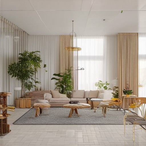
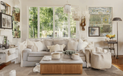
The 3-5-7 rule is a simple yet effective guideline for decorating a room. It suggests focusing on three main elements, five additional pieces, and seven accessories to create a balanced and harmonious space.
- 3 Essential Elements :
- Start with the basics: a place to sit (sofa or chair), a place to eat (dining table), and a bed. These are the primary functional pieces that every room should have.
- 5 Additional Pieces :
- Add five complementary items to enhance the room’s functionality and style. Examples include a coffee table, an armchair, a side table, a console table, and a bookshelf. These pieces add versatility and practicality without overwhelming the space.
- 7 Accessories :
- Incorporate seven decorative items to add personality and detail. Think about a statement piece like a large artwork, a few decorative trays, lamps, plants, rugs, cushions, and curtains. These elements tie the room together and introduce texture and color.
By following the 3-5-7 rule, you can ensure your room feels organized, inviting, and aesthetically pleasing. It’s a great way to avoid clutter while maximizing functionality and beauty.
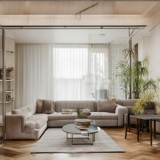
Understanding the 70/30 Rule in Interior Design
The 70/30 rule is a simple yet effective guideline for creating balanced and visually appealing interior designs. This rule suggests that 70% of the room should be dedicated to the dominant style, color palette, or furniture arrangement, while the remaining 30% introduces contrast through textures, patterns, or accent colors.
- 70% Dominant Element: This portion of the room establishes the overall mood and theme. It could be a cohesive color scheme, a predominant furniture style, or a uniform design element like flooring or wall treatments. This creates a sense of stability and harmony.
- 30% Contrast Element: This smaller portion adds interest and personality to the space. It might include bold accents, unique textures, or a pop of a different color. This element ensures the room feels dynamic and less monotonous while maintaining balance.
To implement the 70/30 rule effectively:
- Choose a Main Color Palette: Select 2-3 primary colors that will make up 70% of the room. These colors should complement each other and create a cohesive look.
- Add Accent Colors Sparingly: Use these accent colors for decorative elements like throw pillows, curtains, or artwork, ensuring they don’t overpower the space.
- Balance Textures and Patterns: Incorporate subtle textures or patterns in flooring, upholstery, or wallpaper to add depth without overwhelming the senses.
Examples of the 70/30 Rule in Practice:
- Modern Living Room: A minimalist design with a neutral color palette dominates 70%, while a statement light fixture or an area rug adds contrast.
- Cozy Bedroom: A soft, calming color scheme takes center stage, while a vibrant headboard or bedding adds personality.
This rule is a flexible guide that can be adapted to various styles and room sizes. Whether you’re working with a small apartment or a spacious home, the 70/30 rule offers a balanced approach to creating a visually appealing and comfortable environment.
Understanding the 60-40 Rule in Interior Design
The 60-40 rule is a simple yet effective guideline used in interior design to create balanced and visually appealing spaces. This rule suggests that approximately 60% of a room’s area should be occupied by furniture, while the remaining 40% should remain empty or open.
Why the 60-40 Rule Matters
Adhering to the 60-40 rule helps designers achieve harmony in a room by preventing it from feeling cluttered or too sparse. By ensuring that furniture occupies most of the space, the room feels lived-in and functional, while the open areas allow for breathing room and visual interest.
How to Apply the 60-40 Rule
- Assess the Room Size: Measure the total area of the room to determine how much space will be allocated to furniture and open areas.
- Plan Furniture Placement: Arrange your furniture in a way that maximizes functionality while leaving enough space for movement and decoration.
- Consider Space Requirements: Account for pathways, windows, and doors when placing furniture to ensure the room remains practical and safe.
Examples of the 60-40 Rule in Practice
For example, in a living room measuring 400 square feet, 240 square feet (60%) would be dedicated to seating, tables, and storage, while 160 square feet (40%) would be left for walking space and decorative elements.
Design Principles Complementary to the 60-40 Rule
- Symmetry: Balance furniture arrangement to create a sense of order and equilibrium.
- Color and Texture: Use color schemes and textures to draw attention to both the furnished and open areas of the room.
- Lighting: Position lighting to highlight both the occupied and open spaces, creating a dynamic contrast.
Common Mistakes to Avoid
- Overloading the room with furniture, which violates the 60-40 ratio and can make the space feel cramped.
- Ignoring the function of the room, such as not leaving enough clearance for activities like cooking or working.
- Choosing furniture that is too large for the available space, disrupting the balance of the room.
Conclusion
The 60-40 rule is a versatile tool that can be applied to various room types, from small apartments to large lofts. By balancing furniture and open space, you can create interiors that are both functional and aesthetically pleasing. Experiment with different configurations and let the rule guide you toward a design that suits your lifestyle and preferences.
The 2/3 Rule in Decorating
The 2/3 rule is a simple yet effective guideline often used in decorating to create balanced and visually appealing designs. Here’s a breakdown of how it works:
Color Theory Application
The 2/3 rule can be applied to color theory, suggesting that two colors dominate the palette while the third color is used in smaller quantities. This creates a harmonious balance without overwhelming the senses. For example:
- Use two primary colors as the base of your color scheme.
- Add a third color in smaller doses, such as accents or details.
This approach ensures that the colors don’t clash while still providing visual interest and depth to your space.
Possible Applications
The 2/3 rule isn’t limited to color; it can also apply to patterns, textures, and layers in a design. Here are some examples:
- In Interior Design: Two wall colors dominate the room, while a third color is used for curtains, upholstery, or accents.
- In Fashion: A two-color outfit with a third color added through accessories or details.
- In Art and Craft Projects: Layer two materials or colors and add a third element for texture and dimension.
Examples of Use
Here are real-world examples of the 2/3 rule in action:
- A living room painted in two neutral tones, with a third color used for throw pillows and artwork frames.
- An outfit featuring a striped shirt in two colors, accented with a third color via a scarf or belt.
- A mixed-media artwork where two textures dominate, and a third material adds depth and interest.
Conclusion
The 2/3 rule is a versatile tool for decorators and designers to create cohesive and visually pleasing spaces. By balancing two dominant elements with a third subtle addition, you can achieve a polished and sophisticated look that is both functional and aesthetically pleasing.
The 80/20 Rule in Decorating
The 80/20 rule in decorating is a design principle that suggests using one color or element to dominate 80% of a space, paired with a contrasting or complementary element for the remaining 20%. This ratio aims to create balance, harmony, and visual interest without overwhelming the senses.
Application of the Rule:
- Color Palette:** Typically involves selecting one dominant color (80%) and one accent color (20%). For example, a room with a neutral beige wall (80%) can feature blue accents on pillows, curtains, or artwork (20%).
- Textiles and Fabrics:** Using 80% of one fabric or pattern and 20% of another, such as a floral print dominating a room and a geometric pattern as an accent.
- Furniture:** Incorporating 80% of one style or color and 20% of another, like a mix of modern and vintage pieces.
Considerations:
- Lighting:** The dominant color may change appearance under different lighting conditions, affecting the overall mood of the room.
- Psychological Impact:** Dominant colors can influence mood, with cool tones promoting relaxation and warm tones evoking comfort.
- Balance:** Ensures the room doesn’t feel cluttered or overwhelming, maintaining a calm and organized atmosphere.
This rule is versatile, applying to various elements of a space, helping create a cohesive yet interesting design. By carefully selecting the dominant and accent elements, decorators can achieve a visually appealing and emotionally impactful environment.
What is the 357 Rule in Interior Design?
The 3-5-7 rule in interior design is a simple yet effective guideline that helps create visually appealing and balanced spaces. This rule suggests using groups of three, five, or seven objects or elements in a room to achieve an asymmetrical yet harmonious design.
Here’s a breakdown of how the 3-5-7 rule works:
- Three (3): Start with a trio of identical or complementary elements, such as three paintings, lamps, or decorative bowls.
- Five (5): Add five items in a row or formation, like five vases, candles, or plants, to create movement and visual interest.
- Seven (7): End with seven individual pieces or a larger grouping, such as seven small sculptures or seven chairs arranged around a coffee table.
This rule is particularly useful for:
- Arranging artwork or photos along a wall.
- Placing furniture or seating arrangements.
- Decorating shelves or surfaces with decorative items.
The 3-5-7 rule is a flexible guideline and can be adapted to suit the specific needs and style of a space. By using odd numbers, you create a sense of imbalance that makes the design more dynamic and engaging while still maintaining a cohesive look.
Conclusion: The 3-5-7 rule is a practical tool for interior designers and homeowners to achieve visually interesting and balanced interiors. Experiment with different combinations of three, five, and seven to find the perfect arrangement for your space.

0 Comments