

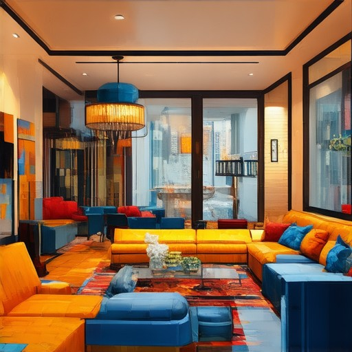
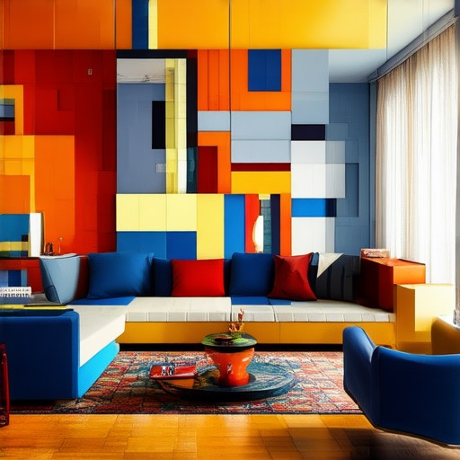
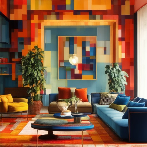
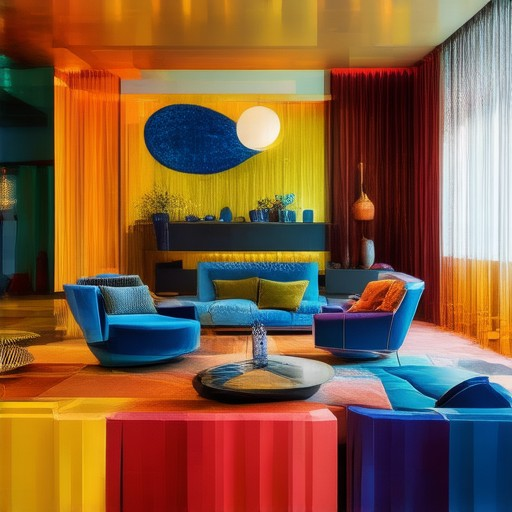
Transforming a space into a vibrant haven that reflects your unique style and enhances your mood is achievable with thoughtful decor choices. While the allure of colorful interiors is undeniable, navigating the right combinations without overwhelming the senses can feel daunting. Whether you’re aiming for a cozy retreat or a bold statement, mastering tips for colorful decor can unlock a world of possibilities. From the 3-5-7 rule to the 60/30/20 principle, this guide delves into proven strategies to infuse life and energy into your home, ensuring every corner tells a story of intentional design. Discover how these time-tested approaches, along with expert tips, can help you create a space that feels as inviting as it does inspiring.
Key Takeaways
- Unlock Vibrant Home Decor with the 3-5-7 Rule: Implement this rule to create a harmonious color distribution, balancing primary, secondary, and accent colors effectively.
- Balance Colors with Primary, Secondary, and Accent Roles: Understand the roles each color plays in your decor to achieve a cohesive and visually appealing space.
- Start Small: Test Bold Colors with Statement Pieces: Begin your color journey with small, impactful items to gauge their effect before full commitment.
- Choose a Cohesive Color Scheme for Harmony: Select a palette that complements your space, ensuring every element works together seamlessly.
- Enhance Depth with Textures and Patterns: Layer colors with textures to add dimension and visual interest to your decor.
- Strategic Accent Walls Avoid Overwhelm: Use vibrant colors sparingly on walls to create focal points without overwhelming the space.
- Personalize with Colorful Accessories: Introduce pops of color through curtains, rugs, and decorative items to infuse personality into your space.
- Tailor Colors to Room Function: Customize your color choices to match the purpose of each room, enhancing both aesthetics and functionality.
- Update Seasonally for Fresh Looks: Refresh your decor by swapping elements like throws and artwork to keep your space current and exciting.
- Balance Boldness with Neutrals for Sophistication: Ground vibrant accents with neutral tones to create a timeless and elegant atmosphere.
- Invest in Durable Paint Finishes: Opt for high-quality paints to ensure your color choices remain vibrant and long-lasting.
- Highlight Color with Strategic Lighting: Use lighting to emphasize colored elements, enhancing the overall ambiance of your space.
- Embrace Drama with Darker Hues in Small Spaces: Introduce deep, rich colors to smaller areas for a dramatic yet cohesive look.
- Reflect and Elevate with Art and Mirrors: Incorporate reflective elements like art and mirrors to add depth and dynamic contrast to your decor.
The 3-5-7 Rule in Decorating
The 3-5-7 rule is a simple yet effective decorating principle that helps create balanced and visually appealing interior designs. By grouping objects and elements in sets of three, five, or seven, you can achieve a harmonious look that feels natural and engaging.
- Three: Start with groups of three. This creates a subtle rhythm that draws the eye and adds visual interest without overwhelming the space. For example, place three identical or complementary items together, like three framed photos or three decorative bowls on a shelf.
- Five: Use groups of five to add movement and depth. Five is a versatile number that works well in larger spaces or when you want to create a dynamic balance. Think about five vases arranged in a row or five artwork pieces scattered across a wall.
- Seven: Seven is ideal for creating a bold statement. Groups of seven can add drama and visual weight, perfect for focal points in a room. For instance, seven candles on a centerpiece table or seven decorative pillows on a sofa.
Design Tips Using the 3-5-7 Rule
- Color Palettes: Stick to complementary colors when using the 3-5-7 rule. Pair muted tones with vibrant accents to create contrast and draw attention to specific areas of the room.
- Symmetry and Balance: Use the rule to guide symmetry in your design. Group similar elements together to mimic natural human movement patterns, making the space feel more inviting and comfortable.
- Layering: Incorporate layers through textures and materials. Mix smooth surfaces with rough textures to add dimensionality and visual interest, enhancing the overall aesthetic without overwhelming the senses.
Real-Life Application Example
Imagine a cozy living room decorated using the 3-5-7 rule. You might have three throw pillows on the sofa, five books on a side table, and seven decorative items arranged on a shelf. This arrangement creates a balanced, inviting space that feels purposeful and well-planned.
By applying the 3-5-7 rule thoughtfully, you can transform any room into a space that feels polished and intentional. Experiment with different combinations and let your creativity guide you toward a design that resonates with your personal style.
- Explore More Interior Design Tips
- Understanding Color Theory in Interior Design
- How to Create a Cozy Home
What is the 60/30/20 rule in decorating?
The 60/30/20 rule is a simple yet effective color scheme for decorating interior spaces. This rule suggests dividing the room into three parts:
- 60% Dominant Color: This is the primary color that creates the overall mood and feel of the room. It should be used on large elements like walls, soft furnishings, and window treatments.
- 30% Secondary Color: This complements the dominant color and adds depth. It can be used on accents like curtains, pillows, or decorative objects.
- 10% Accent Color: This is the smallest portion and serves as the finishing touch. It can be used sparingly on smaller details like lamps, artwork, or decorative trays.
This rule helps create a balanced and harmonious look while preventing the room from appearing too overwhelming or chaotic. The 60/30/20 breakdown ensures that the dominant color isn’t overpowering, while the accent color adds just enough interest without competing for attention.
Understanding the 70/20/10 Color Rule
The 70/20/10 rule is a simple yet effective color scheme that helps create balance and visual interest in a space. Here’s a breakdown of how it works:
70% – Dominant Color
The majority of your room’s decor should be dominated by one color. This color should be used on large-scale elements like walls, curtains, or furniture. It creates a cohesive backdrop that ties the room together.
20% – Secondary Color
The second color should complement the dominant color and add contrast. This can be used on smaller elements like throw pillows, blankets, or decorative accessories. It helps to draw attention to specific areas of the room without overwhelming the space.
10% – Accent Color
The accent color is used sparingly, often on small details like picture frames, vases, or lamps. It adds a pop of color and helps to define the character of the room.
Examples of Application
- In a living room, you might use a neutral color (70%) for the walls, a darker shade (20%) for the sofa and curtains, and a bold color (10%) for throw pillows and artwork.
- In a bedroom, light tones (70%) can be used for the ceiling and bedding, a medium tone (20%) for the walls, and a vibrant color (10%) for bedding accents and curtains.
When to Use the 70/20/10 Rule
This rule works well in spaces where you want a calm and harmonious atmosphere. It’s particularly useful in small rooms where too many colors can feel overwhelming. For larger, more complex spaces, consider using a 60/30/10 or 40/30/30 scheme instead.
By balancing these three colors, you can create a visually appealing and balanced interior design that feels modern and sophisticated.
The Three Color Rule in Interior Design
The Three Color Rule is a simple yet effective guideline for creating a harmonious and visually appealing interior design. It suggests using three distinct colors in a space: a dominant color, a secondary color, and an accent color. Here’s a breakdown of how to implement this rule:
- Primary Color: This is the main color that should appear the most in the room. It can cover approximately 60% of the space and is often used for large areas like walls, flooring, or furniture.
- Secondary Color: This color should be used next, covering about 30% of the space. It can appear in smaller areas or as accents, such as window treatments, cushions, or decorative items.
- Accent Color: This is the smallest color, used minimally (around 10%) for highlights and details. It can be used for small decor pieces, artwork, or architectural elements.
To apply the Three Color Rule effectively:
- Choose the primary color first, ensuring it creates a cohesive backdrop for the space.
- Select the secondary color to complement the primary color, ensuring it doesn’t clash and adds interest to smaller areas.
- Add the accent color sparingly to highlight specific elements, creating visual interest without overwhelming the space.
This rule helps prevent color overload and ensures that the room feels balanced and coordinated. By focusing on three colors, you can create a more unified look while still incorporating personality and style.
What Are the Best Tips for Incorporating Color into Home Decor?
Here’s a step-by-step guide to help you effectively incorporate color into your home decor:
-
Start Small with Statement Pieces
Introduce color gradually by adding bold accents like a colorful throw pillow, a unique vase, or a striking piece of artwork. This allows you to test the impact of each color without committing to large-scale changes.
-
Choose a Cohesive Palette
Decide on a color scheme that aligns with your home’s overall vibe. Consider using complementary colors (like blue and yellow) or harmonious analogous colors (like cool grays and warm blues) to create a balanced look.
-
Layer Textures and Patterns
Combine colored elements with textures and patterns to add visual interest. For instance, pair a bright red sofa with a textured blanket or a floral wallpaper backdrop for a dynamic contrast.
-
Use Accent Walls Strategically
Limit the use of extremely vibrant colors to one or two walls to avoid overwhelming your space. Opt for softer tones or high-quality paint finishes to ensure durability and ease of maintenance.
-
Add Colorful Accessories
Personalize your space with colorful accessories like curtains, blinds, rugs, and decorative items. These pieces can tie a room together while introducing subtle pops of color.
-
Consider Room Functionality
Tailor your color choices to the purpose of each room. For example, use calming tones in the bedroom for relaxation or energizing colors in the kitchen to boost productivity.
-
Experiment with Seasonal Changes
Update your color palette seasonally by swapping out throws, curtains, or artwork. This keeps your space fresh and aligned with current trends without major commitments.
-
Don’t Fear Neutral Tones
While bold colors can make a statement, neutral tones like beige, gray, or white provide a timeless foundation. Use neutrals to balance vibrant accents and create a sophisticated atmosphere.
-
Invest in High-Quality Paint
When painting, opt for high-quality paints that are low-VOC and durable. This ensures your color choices will last and remain vibrant over time.
-
Use Lighting to Enhance Color Impact
Position lighting to highlight your colored features. For example, place lamps near accent walls or use directional lighting to showcase vibrant decor elements.
By thoughtfully incorporating color into your home decor, you can create a space that feels lively, inviting, and uniquely yours. Remember to balance bold statements with neutral tones and consider functionality alongside aesthetics for a cohesive and visually appealing design.
Incorporating Color into Home Decor: Expert Tips
Transforming your home decor with color can create a vibrant and inviting atmosphere. Here are some expert tips to help you achieve the perfect balance of style and personality:
- Choose a Dominant Palette: Select one or two primary colors that will form the backbone of your decor scheme. These colors should complement each other and create harmony throughout the room.
- Introduce Accent Colors: Use bold, contrasting colors for decorative elements like throw pillows, curtains, or artwork to add visual interest and energy to the space.
- Consider Wall Colors: Paint an entire wall or feature wall with a striking color to make a statement. Stick to lighter shades for smaller rooms to maintain openness.
- Play with Texture: Combine colors with textures like wallpaper, wood tones, or fabrics to create depth and dimension in your decor.
- Accessorize Strategically: Use colored vases, lamps, or trays to tie your color choices together without overwhelming the space.
- Use Curtains and Blinds: Opt for colorful drapes or blinds to add softness and warmth to windows while introducing a pop of color.
- Experiment with Small Spaces: Start with low-commitment areas like console tables, planters, or decorative bowls to test color combinations before committing to larger areas.
- Think About Lighting: Use colored lighting fixtures or lampshades to enhance the mood and add a touch of color to the room’s ambiance.
- Don’t Fear Darker Hues: Deep, rich colors can add drama and sophistication, especially in smaller spaces where they can feel cohesive rather than overwhelming.
- Accessorize with Art and Mirrors: Incorporate framed art pieces or decorative mirrors in vibrant frames to introduce color and reflect light, making the space feel more dynamic.
Remember, the key is to balance bold statements with subtle touches to create a cohesive and visually appealing home environment. With thoughtful planning and a sense of adventure, you can easily incorporate color into your decor and elevate your space to new heights of style.


0 Comments