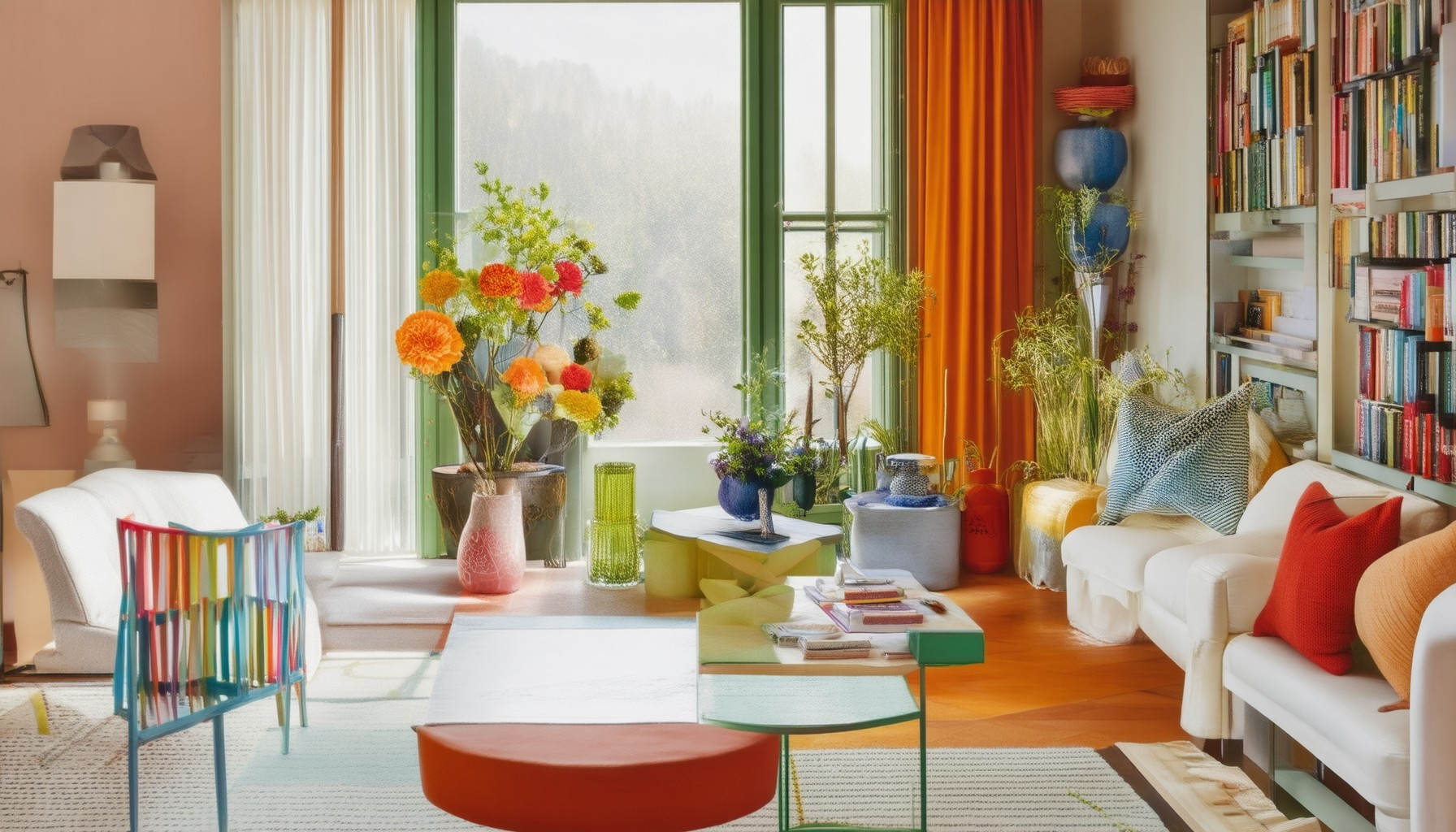
Decorating a space with color is one of the most transformative ways to refresh and revitalize your home or office. Whether you’re aiming for a cozy retreat, a vibrant workspace, or a sleek modern haven, the right color choices can elevate your environment to new heights. With the ever-evolving trends of 2024, mastering the art of decorating with color has never been more essential. This guide delves into the key principles, color schemes, and design rules that will help you create a space that feels polished, cohesive, and truly yours. From understanding the basics of color theory to exploring the latest 2024 color trends, this comprehensive resource will walk you through everything you need to know to decorate with confidence and style.

What is the decorating color rule?
The decorating color rule, often referred to as the 60-30-10 rule, is a simple yet effective guideline for selecting paint colors in a room. Here’s how it works:
- 60% Dominant Color : This is the main color that should cover approximately 60% of the room’s walls or surfaces. It sets the overall mood and tone of the space.
- 30% Secondary Color : This complements the dominant color, covering about 30% of the room. It adds depth and interest without overwhelming the space.
- 10% Accent Color : This is used sparingly, typically on decorative elements like throw pillows, curtains, or artwork, and accounts for just 10% of the color scheme.
For example, in a living room with soft beige walls (60%), you might choose a deep navy for the sofa and window treatments (30%), and a pop of red in an area rug or vase (10%). This balance creates harmony while adding visual interest.
To enhance your space further, consider the room’s size and lighting. Lighter rooms benefit from lighter tones, while deeper spaces can embrace richer hues. Consistency in color palette across floors, walls, and accents ensures a cohesive look.
How to Decorate a Room with Color
Decorating a room with color can transform the space into a vibrant and inviting atmosphere. Whether you’re working with a small budget or an extensive remodel, here are expert tips and ideas to incorporate color effectively.
1. Choose a Color Palette
Start by selecting a cohesive color palette that aligns with the room’s function and style. Consider the following:
- Neutral Tones: Opt for calming hues like beige, light gray, or white for a timeless look.
- Complementary Colors: Use colors opposite each other on the color wheel for a bold statement, like navy blue and gold.
- Analogous Colors: Create harmony with colors next to each other on the wheel, such as soft blues and greens.
- Monochromatic: Stick to a single color for a minimalist, sophisticated vibe.
2. Incorporate Color on Walls
The walls are the largest surface, so they play a crucial role in defining the room’s personality. Here’s how to get it right:
- Full-Wall Statements: Use bold colors like deep reds or jewel tones to make a dramatic impact.
- Accent Walls: Paint one wall a contrasting color to add visual interest without overwhelming the space.
- Stripes and Patterns: Introduce geometric patterns or stripes for a modern, dynamic look.
- Textured Finishes: Try chalk paint, metallic finishes, or textured wallpaper for added dimension.
3. Add Color Through Soft Furnishings
Color can be seamlessly integrated into fabrics and textiles for a cozy, stylish feel:
- Curtains and Blinds: Use drapes in rich colors or patterns to frame the windows.
- Upholstered Furniture: Update couches, chairs, or headboards with colorful fabric swatches.
- Bedsheets and Throws: Add vibrant bedding or throws for instant color pops.
- Rugs: A bold rug can tie the room together and add warmth underfoot.
4.Accessorize with Colorful Elements
Small touches can make a big difference:
- Art and Decor: Frame vintage finds or original artwork in eye-catching frames.
- Lighting: Use colored lamps or pendant lights to introduce subtle hues.
- Plants: Brightly colored plants or flowers can add life and energy to the room.
- Cookware and Tableware: Opt for colorful dishes or serving pieces for a culinary-inspired look.
5. Coordinate Colors with Lighting
Lighting plays a crucial role in how colors appear. Consider:
- Warm Lighting: Yellow or orange tones create a cozy, intimate ambiance.
- Cool Lighting: Blue or green tones can make a room feel cooler and more relaxed.
- Task Lighting: Use colored accents for focused illumination.
- Overall Ambiance: Balance the lighting with your chosen color scheme for a harmonious look.
6. Test and Adjust
Before finalizing, test your color choices by viewing the room at different times of the day and in varying lighting conditions. Adjustments may be needed to ensure the colors look balanced and cohesive.
With thoughtful planning and execution, you can create a room that feels fresh, inviting, and uniquely yours. Remember, decorating is about personal style, so don’t hesitate to mix textures, patterns, and colors to achieve your vision.

What is the 60/30/20 rule in decorating?
The 60/30/20 rule is a simple yet effective color scheme for decorating interior spaces. This rule suggests dividing the room into three parts:
- 60% Dominant Color: This is the primary color that creates the overall mood and feel of the room. It should be used on large elements like walls, soft furnishings, and window treatments.
- 30% Secondary Color: This complements the dominant color and adds depth. It can be used on accents like curtains, pillows, or decorative objects.
- 10% Accent Color: This is the smallest portion and serves as the finishing touch. It can be used sparingly on smaller details like lamps, artwork, or decorative trays.
This rule helps create a balanced and harmonious look while preventing the room from appearing too overwhelming or chaotic. The 60/30/20 breakdown ensures that the dominant color isn’t overpowering, while the accent color adds just enough interest without competing for attention.

What is the 70/20/10 color rule?
The 70/20/10 color rule is a fundamental principle in interior design and decorative design that helps create visual interest and balance in a space. This rule suggests using three different colors in specific proportions:
- Primary Color (70%) : This is the dominant color in the room, covering approximately 70% of the area. It sets the overall mood and tone of the space.
- Secondary Color (20%) : This complements the primary color, appearing on surfaces like walls, curtains, or furniture, making up about 20% of the space.
- Accent Color (10%) : This is used sparingly, often on small details like throw pillows, artwork, or decorative objects, contributing just 10% of the color palette.
This rule allows for a layered effect, ensuring the room feels dynamic without overwhelming the senses. By balancing these colors, designers can create a cohesive yet visually appealing environment.
The Golden Rule of Color
The golden rule of color, often referred to as the 60-30-10 principle, is a guideline used in design to create harmonious and visually appealing compositions. This rule suggests that the dominant color should occupy approximately 60% of the composition, the secondary color around 30%, and the tertiary color about 10%. This balance helps in creating a sense of order and visual interest.
Components of the Golden Rule:
- Dominant Color (60%): This is the primary color that draws attention and sets the overall tone of the design. It should be used consistently to create recognition and brand identity.
- Secondary Color (30%): This complements the dominant color, adding depth and variety without overwhelming the viewer. It can be used in smaller accents or details.
- Tertiary Color (10%): This is used sparingly to add contrast and interest. It can highlight specific elements or create visual interest in the design.
Application of the Golden Rule:
The golden rule is widely used in various design fields, including web design, branding, and interior design. By adhering to this principle, designers can create cohesive and aesthetically pleasing designs that effectively communicate their intended message. For example, in website design, using a dominant color for the majority of the page, a secondary color for navigation bars or buttons, and a tertiary color for highlights or accents can create a balanced and professional look.
Importance of the Golden Rule:
While the golden rule provides a helpful framework, it’s important to note that it can be adapted to suit specific needs and styles. The key is to ensure that the chosen color palette aligns with the design’s purpose and the target audience’s expectations. Balancing colors thoughtfully can lead to better engagement and a more memorable user experience.

The Four Color Rules Explained
Understanding the four color rules is essential for anyone working with color theory in design, whether it’s for interior design, branding, or digital content creation. These principles guide how colors interact and create visual harmony.
1. Color Harmony
Color harmony refers to the balance and coordination of colors in a design. The goal is to create a visually pleasing composition where colors complement each other without clashing. There are several types of color harmony:
- Monochromatic: Using a single color or its shades for a cohesive look.
- Complementary: Using two colors opposite each other on the color wheel, like blue and orange.
- Analogous: Using colors next to each other on the color wheel, creating a smooth color transition.
- Harmonious: Using colors that share common elements, such as similar hues or undertones.
2. Color Contrast
Contrast is the difference between light and dark colors, which helps create visual interest and enhances readability. Proper contrast ensures that text is readable against backgrounds, and objects stand out in images. High contrast can also add drama to designs, but it should be balanced to avoid straining the eyes.
3. Color Psychology
Colors have psychological effects on people, influencing emotions and perceptions. For example:
- Warm colors: Like red, yellow, and orange, are stimulating and energizing.
- Cool colors: Like blue, green, and purple, are calming and soothing.
- Neutral colors: Like gray, beige, and white, provide a clean, versatile backdrop.
4. Color Trends
Staying updated on color trends is crucial for modern design. Recent trends include:
- Earthy tones: Brown, green, and terracotta shades are popular for natural, grounding aesthetics.
- Vibrant hues: Bold, saturated colors like neon pink, electric blue, and lime green add excitement to designs.
- Soft pastels: Subtle, muted colors offer a delicate and elegant touch.
Conclusion
Mastering the four color rules takes practice and experimentation. By understanding color theory, you can create designs that are not only aesthetically pleasing but also highly functional and emotionally resonant. Whether you’re designing a room, branding a product, or developing a website, these principles will guide your decisions and help you achieve the desired visual impact.


0 Comments